Improving the reading experience for millions of Wikipedia users globally
Role
Lead UX Designer
Skills
Visual design
User experience
Design systems
Design strategy
Context and my role
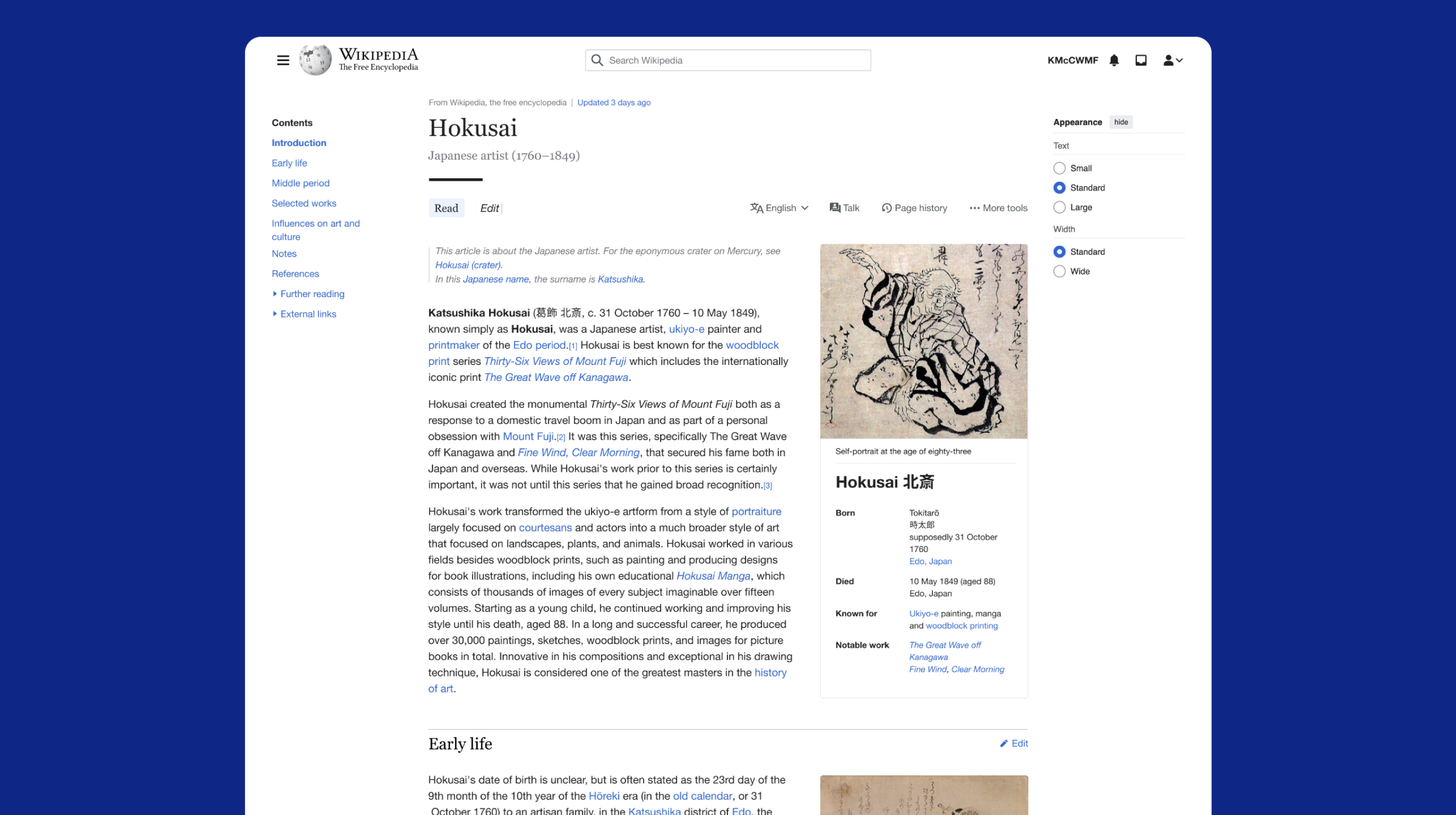
Wikipedia is the fundamental pillar of knowledge on the internet. As of 2026, it has grown to over 300 languages, is maintained by an approximate 633,000 active community editors, and is one of the world’s most visited websites. In my role as Lead UX Designer at the Wikimedia Foundation – the nonprofit that hosts Wikipedia – I provided visual design direction on the first large-scale redesign of Wikipedia in over 15 years.
The challenge
Wikipedia’s interface had remained largely unchanged for over a decade. Advances in web design and technology had left it behind and its ‘early web’ styling led many to perceive it as a legacy site. Working with the Readers Web Team, my role was specific – to push the limits of how far we could modernise the desktop experience for a new generation of users without losing the recognisable character that makes Wikipedia feel like Wikipedia.
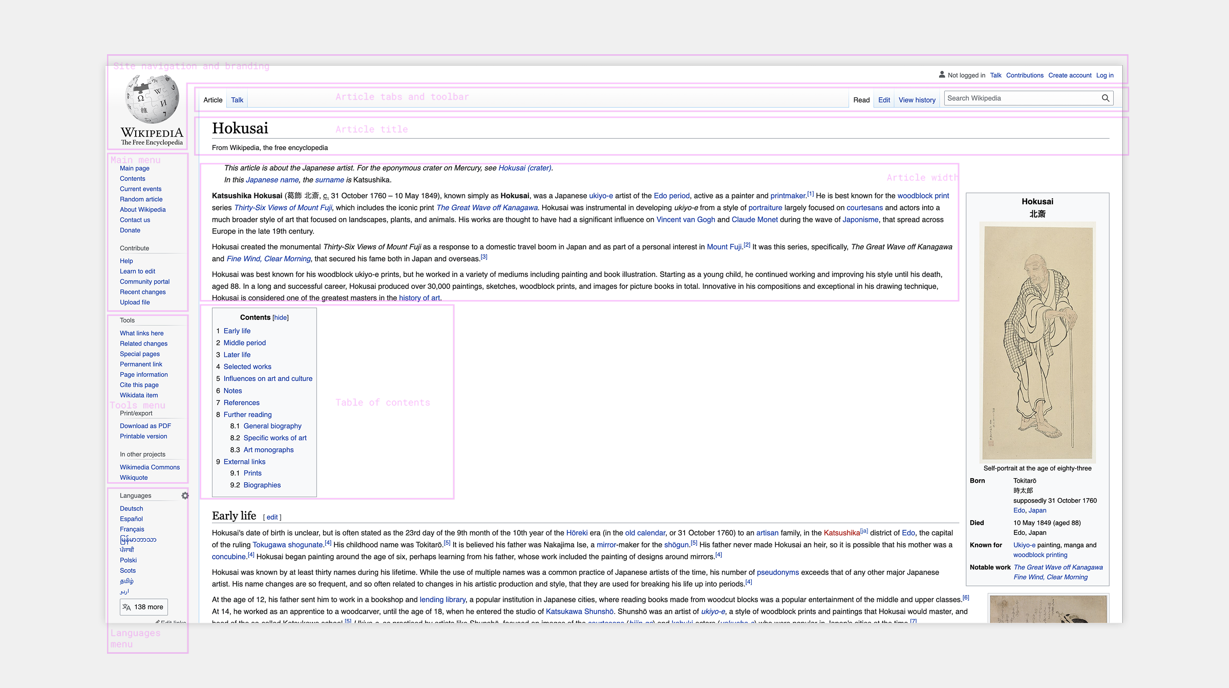
Breaking down the page elements and identifying the issues with Wikipedia’s ‘Vector’ skin which had been in use since 2010.
Process
My first step was to break the interface down into its component parts. This helped us prioritise the key issues we wanted to address – the ever-expanding line length which led to a poor reading experience on large screens; an imposing ‘chrome’ frame that distracted users from the article content; the awkward space created by the table of contents; and the lack of a clear hierarchy in navigational elements.
What makes Wikipedia recognisable?
The most important early question we asked ourselves was: what visual elements of the current design provide the brand essence of Wikipedia? As a team we narrowed this down to the ‘browser default’ blue link colour; the subtle use of grey and blue gradients on backgrounds and borders; and the functional, utilitarian approach to typography. These elements heavily informed my design explorations and it became a constant question of whether to reduce or amplify these visual signatures.
Branding, navigation and the article toolbar
I began with site branding and navigation, reducing the footprint of the logo to put more focus on search and key navigation, and explored how we could make more of a feature of the brand gradients.
Usability research showed the article toolbar was often missed or misunderstood, so I more clearly separated its primary and secondary actions and again explored the use of gradients and borders as a nod to Wikipedia visual heritage.
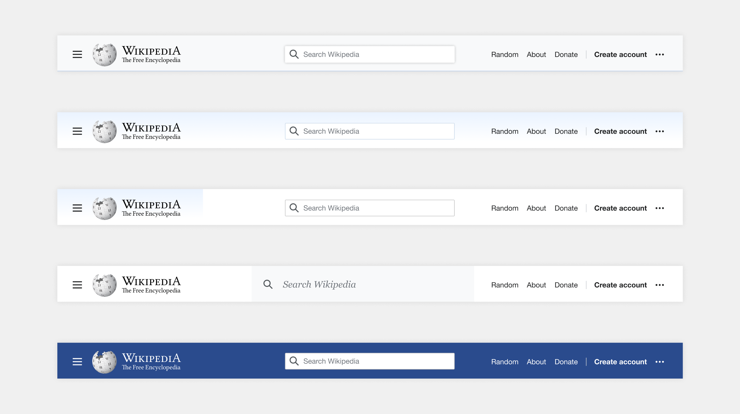
Design explorations for site navigation bar.
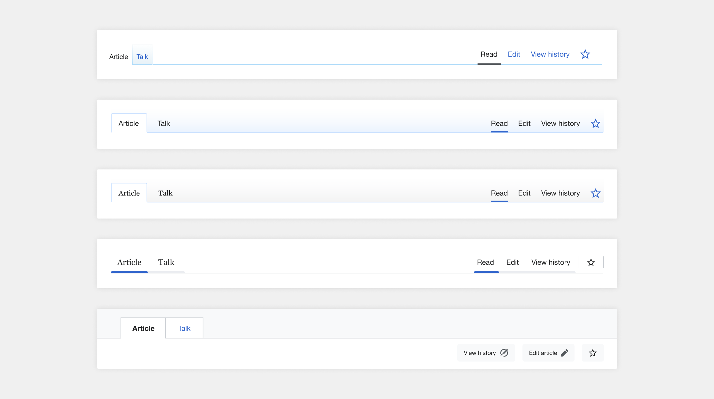
Design explorations for article toolbar which looked at different approaches in bringing out recognisable Wikipedia visual characteristics and create a clearer hierarchy between the navigation elements.
The table of contents
As a core navigation element the team had prioritised, the table of contents became a mini-project in its own right. I experimented with typographic variation, framing, spacing and animated interaction patterns to create clearer hierarchy and make it easier for readers to orient themselves within long articles.
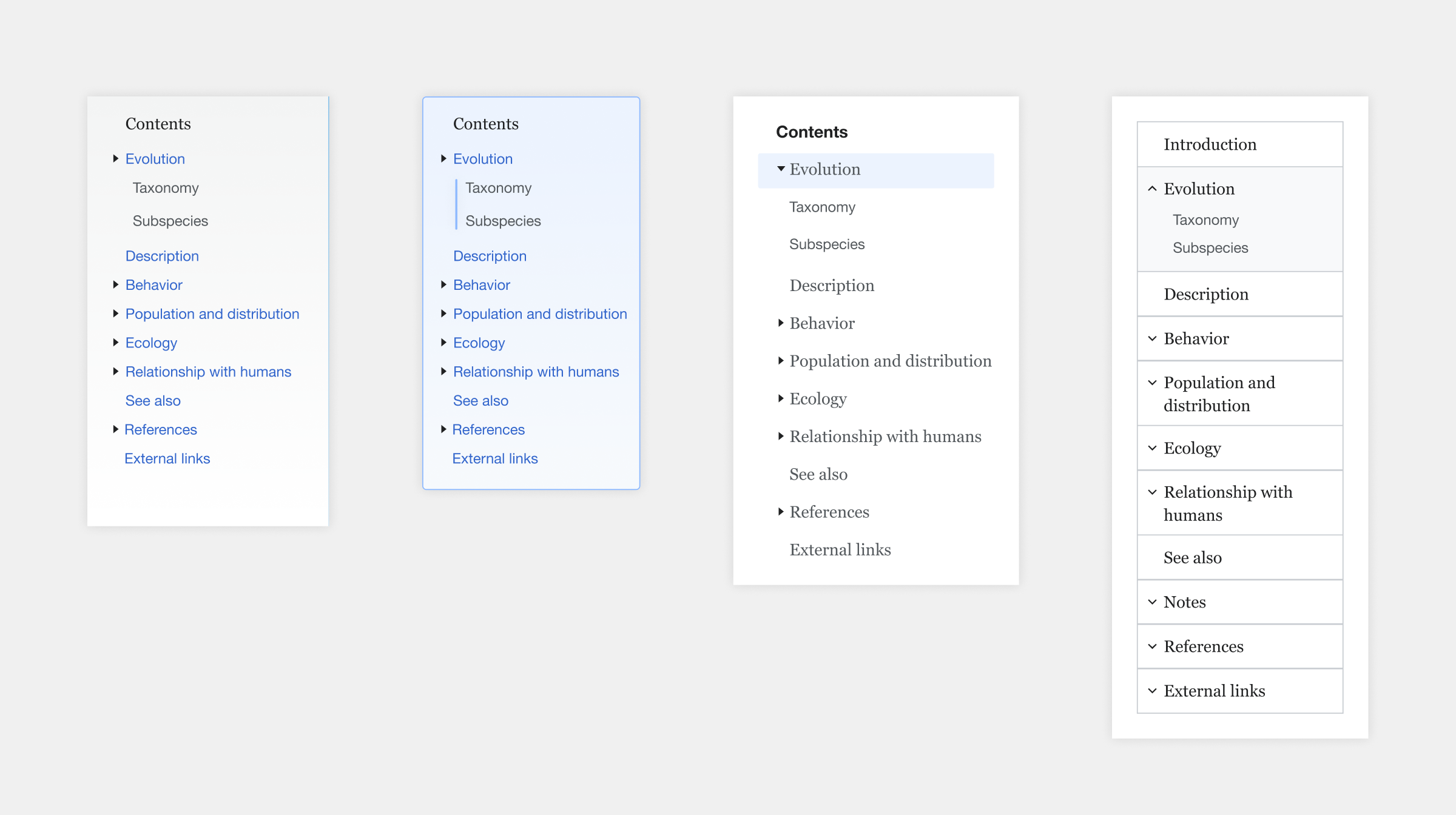
Examples of the table of contents design exploration which used typographic variation, framing and spacing to more clearly communicate the article structure.
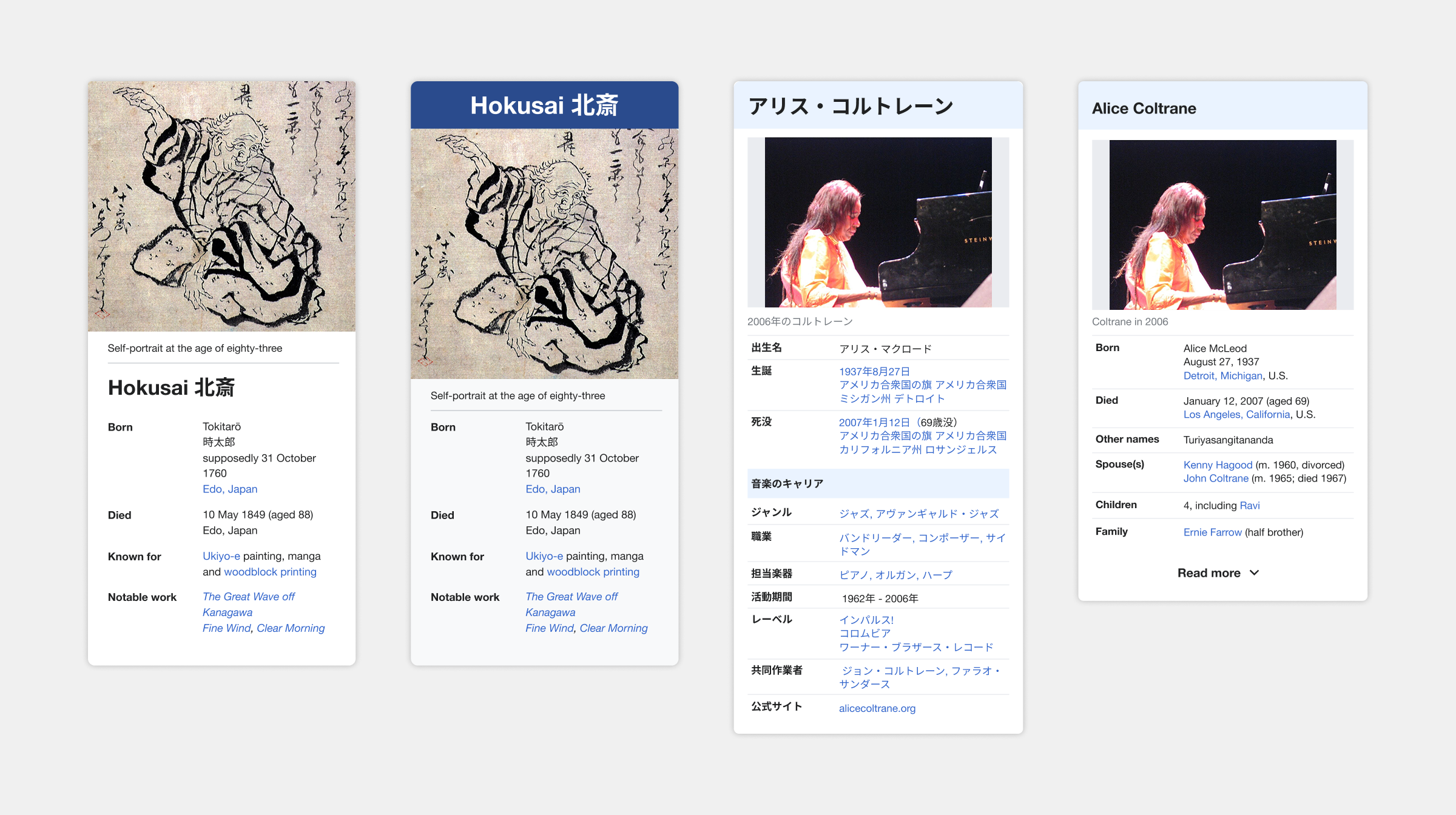
Article infoboxes on Wikipedia have huge variations between article types and across different Wikis. This shows some initial explorations I did to improve the scannability and consistency of this component but in the end we decided these were better owned by the communities and applying a strict system to this component would be more problematic.
Typography and readability
Wikipedia is primarily a text based platform, and we had identified readability as an area that required improvement, so much of my work focussed on the use of micro and macro typography. The specifics I explored included:
- increasing the base font size,
- finding an optimum line measure for text to improve overall reading comfort and retention,
- creating a more distinct visual hierarchy in heading sizes,
- exploring alternative link styling,
- reversing the current use of serif/sans-serif so that serif became the body text,
- increasing vertical spacing to reduce the visual density of content and allowing readers’ eyes to rest,
- hanging headers with indented page sections to allow for easier scanning of long articles,
- increasing the prominence of footnotes as a way of recognising source material and increasing transparency and trust in articles.
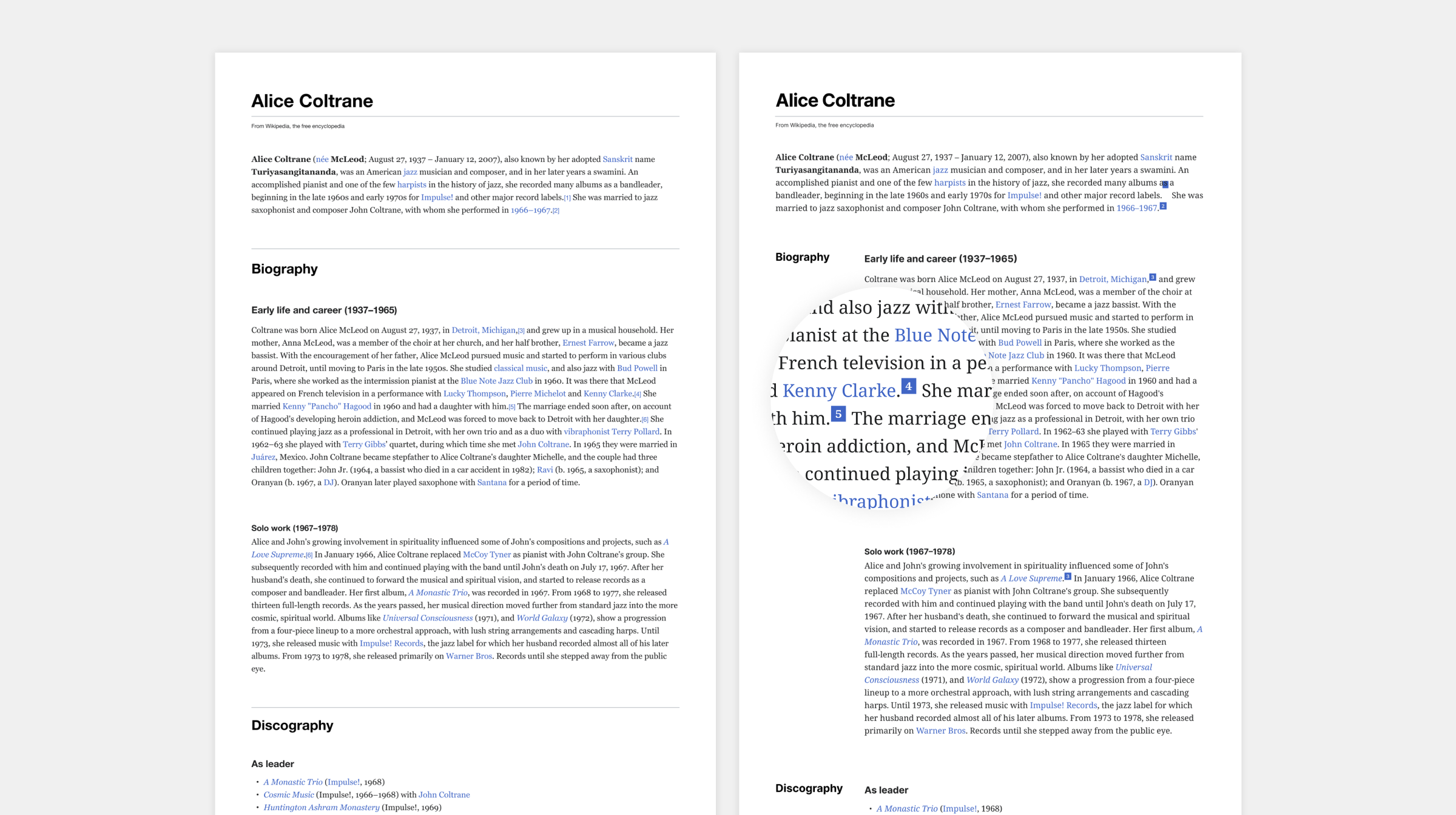
A large part of my work on this project looked at micro and macro typography to explore how we could improve readability.
In addition to these typography improvements I identified that our existing iconography was too visually dominant. I developed a proposal for new icons that reduced their weight by using outlines rather than solid shapes which improved the visual balance with our typography.
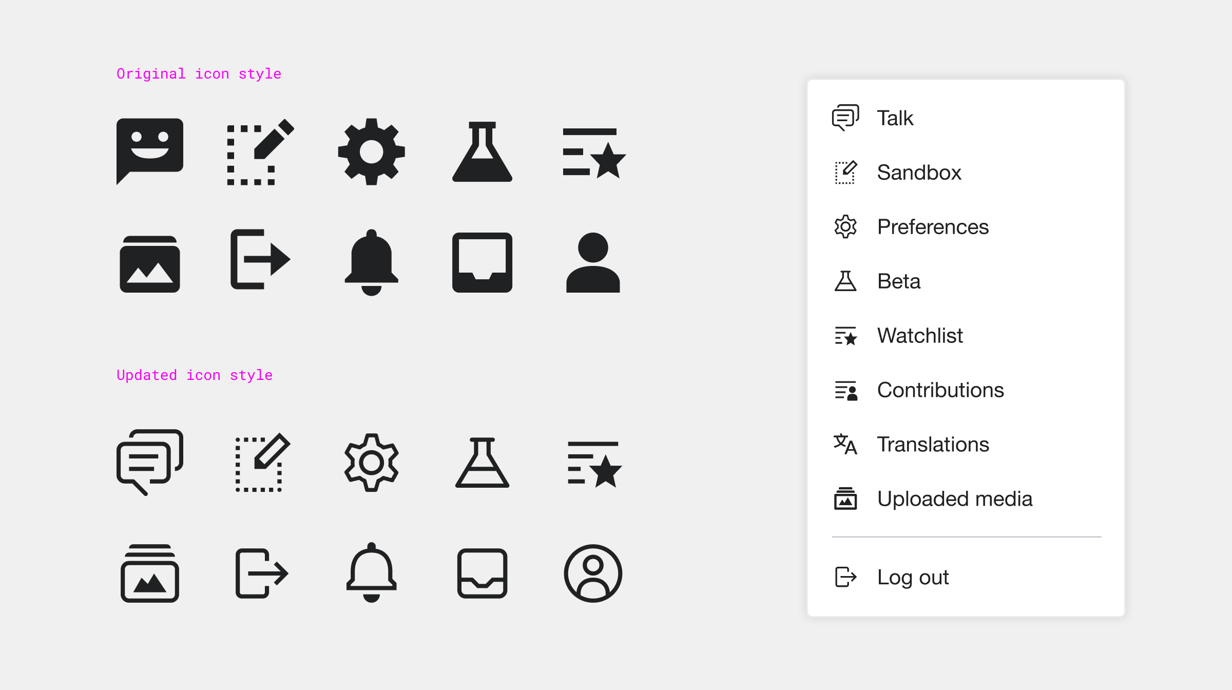
My proposal for the redesign of Wikipedia iconography. Our existing icons were heavy and very visually dominant. My redesigned icons used outlines rather than solid shapes which created balance with typography.
Layout
To improve the overall visual structure of the page I introduced a layout grid to create a system for responsive layouts and to create consistency across all Wiki platforms. This work is documented in more detail in my post on the Wikimedia Design Blog.
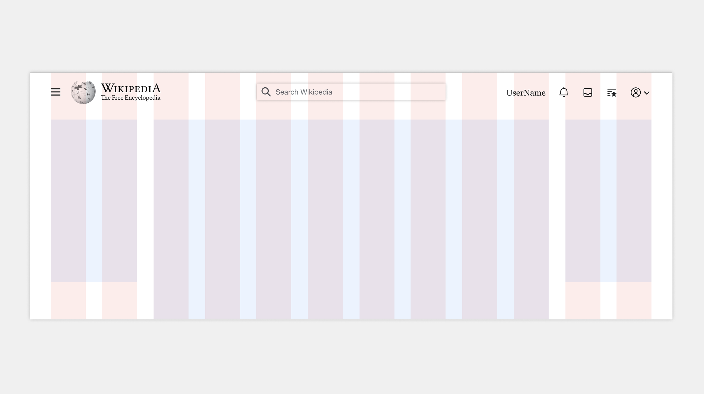
My introduction of a layout grid to our design system aimed to create structural consistency across the various Wikimedia platforms.
The page frame – Wikipedia’s signature
The page frame is arguably the most recognisable element of the site; its gradient and strokes providing Wikipedia’s visual signature. I explored many ways that these framing elements could be used to logically divide the content areas and draw attention to specific parts of the page. One particular line of exploration looked at how we might elevate the article from the page (similar to how you might experience a cloud-based word processor) to create a sense of it being a ‘living document’ that many people are collaborating on.
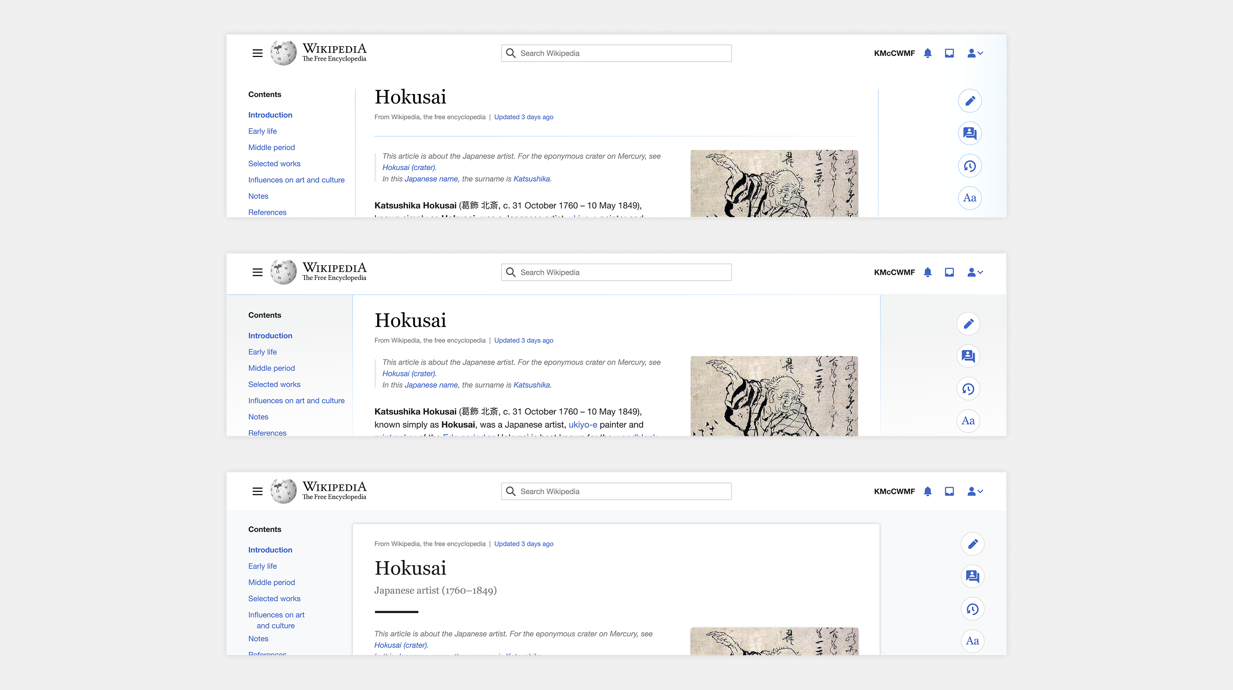
Examples of page frame design explorations that looked at the various degrees to which we may want to divide the page sections up and amplify the brand elements.
Designing for every reader
In parallel with this work, I ran a research project exploring what it really means to design for a platform which fully supports multi-script typography. I presented this to designers and engineers to build a shared understanding of why typographic standards are not universal, and how that complexity should inform our work for a global audience.
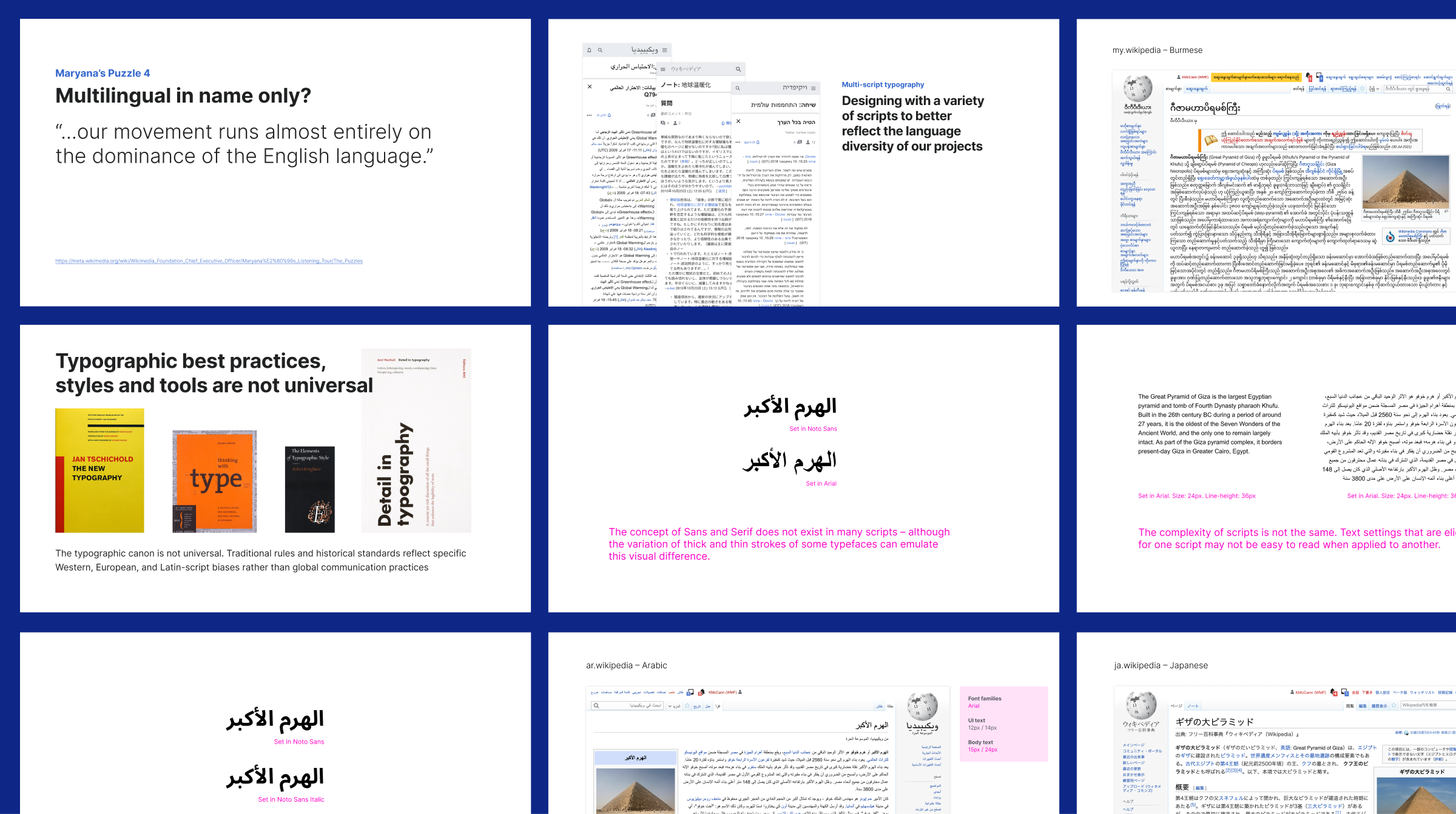
Slides from my research presentation aimed at countering the dominance of the English language and typographic standards that have a Latin script bias.
Impact of Vector 2022
In 2022 the new Wikipedia ‘skin’ was launched. It provided a vastly improved reading experience which was measured to reduce scroll fatigue, increase use of article navigation, and increase reader retention. As of 2026, the new design has been accepted as the default ‘skin’ for all language Wikipedia’s. The change was deployed without negative impact on page views, account creation or edit rates, and the Wikimedia Foundation’s own testing reported:
- +30% increase in user searches,
- -15% reduction in scrolling, confirming the improved reading and navigation experience.