A new visual language for Change.org creating positive impact across key metrics
Role
Lead Product Designer
Skills
Design strategy
Visual design
User experience
Design systems
Illustration
Context and my role
Change.org is the world’s number one petition platform – a home for social change, where people create, share and support petitions to influence decision-makers. With over 580 million registered users, it has proven impact in driving change at local, national and global levels. As Lead Product Designer I owned several of the organisation’s most strategically important projects: increasing engagement with US elected officials, the delivery of a new design system, and the redesign of the petition page. Leading the design system I managed a team of five designers, guiding the rollout across each of their product areas.
The challenge
Change.org had not been significantly redesigned since its launch in 2012. User research found the visual design was seen as dated and the petition pages lacked impact. It was also felt that the heavy reliance on our red brand colour was limiting and communicated a negative sense of alarm. My comparative analysis highlighted that newer competitors had far more dynamic and approachable platforms. Despite our scale and reach, there was a risk of us being left behind.
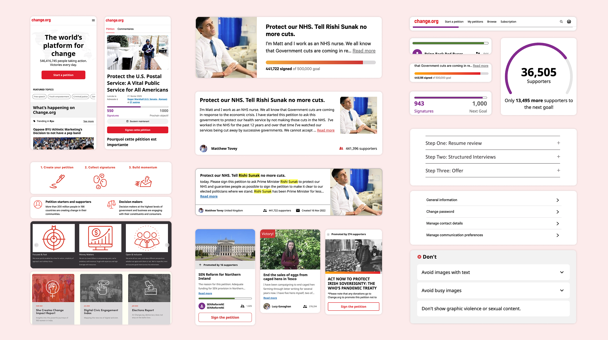
My visual audit of Change.org’s various platforms highlighted growing inconsistencies and often multiple variations of the same components.
Process
Working alongside the Creative Director, I created a new visual language and design system. Knowing the risk that can come with a major redesign of this scale, we set the modest objective of not negatively impacting our key metrics – new petitions created; petitions supported through signatures and sharing; and revenue growth from paid promotion and membership.
I set out to make the brand more human and emotionally resonant, expressing a sense of hope and forward momentum. I expanded the visual foundations – colour palette, typography, spacing, elevation, interactive states – into a more flexible, workable system. From these foundations I built a library of the core components required to transition the current platform over to the new system.
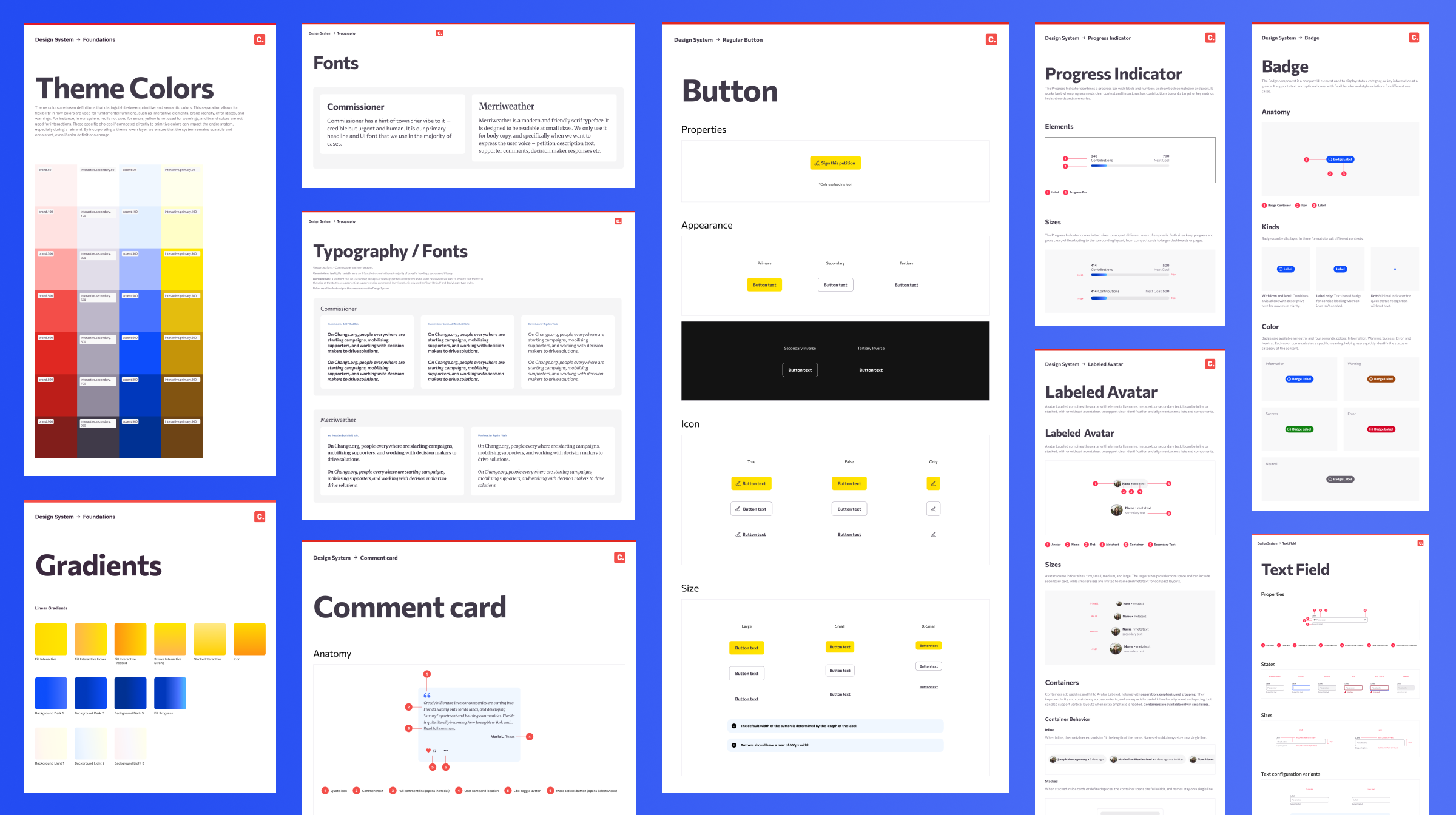
Documentation for the new design system.
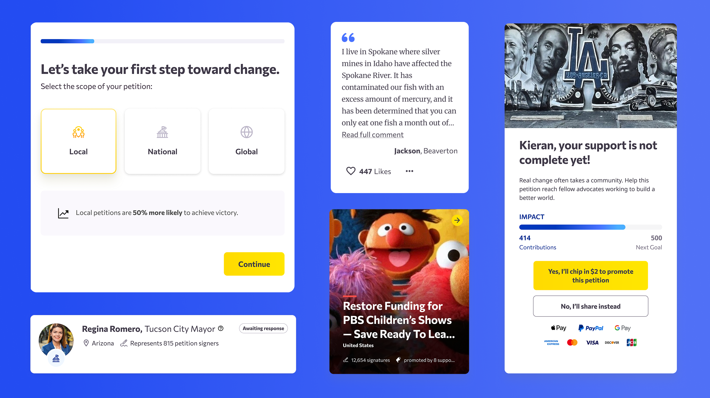
Core components and patterns for the key site surfaces and journeys were redesigned and tested in a staged rollout to carefully measure impact.
‘Sunrise’ – a visual language of hope and momentum
Our most debated decision was changing our primary call-to-action colour from red to yellow. Breaking from our primary brand colour worried many internal stakeholders, but I argued that communicating a sense of positivity and momentum required a brighter, more optimistic action colour – signing a petition should feel like a positive action rather than a destructive one. To build confidence in the decision we ran multiple experiments across the platform. This single change transformed the mood of the site toward one of optimism and hope and gave the design system its name – ‘Sunrise’.
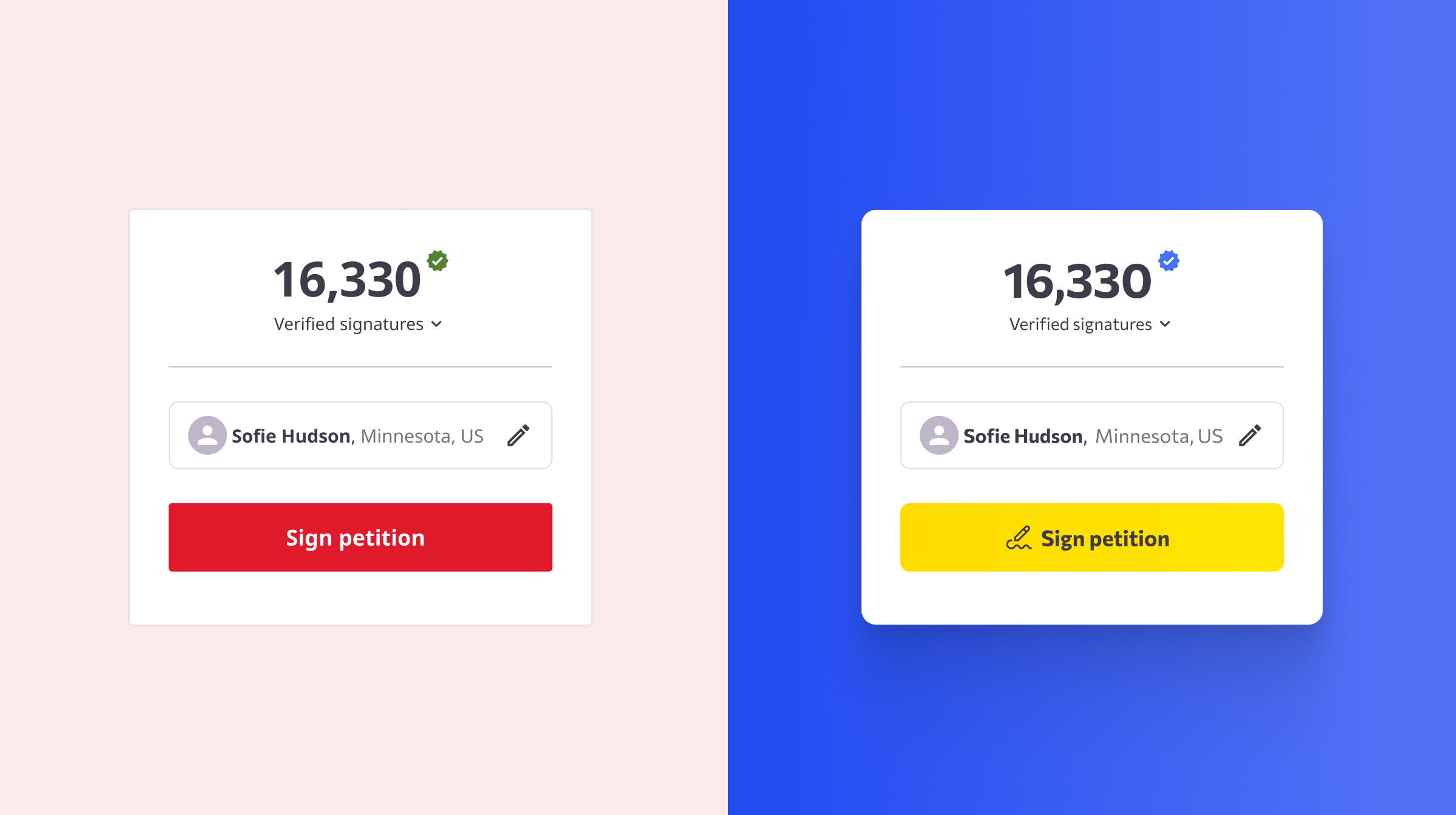
Changing our primary action colour required careful management and experiments to build evidence and convince leadership to depart from the traditional brand red.
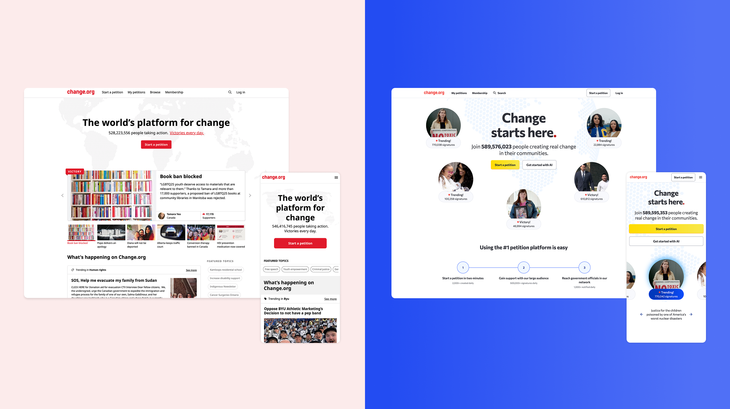
Comparison of the old and new homepage. My new redesign led to a 10% increase on new petitions started from the homepage.
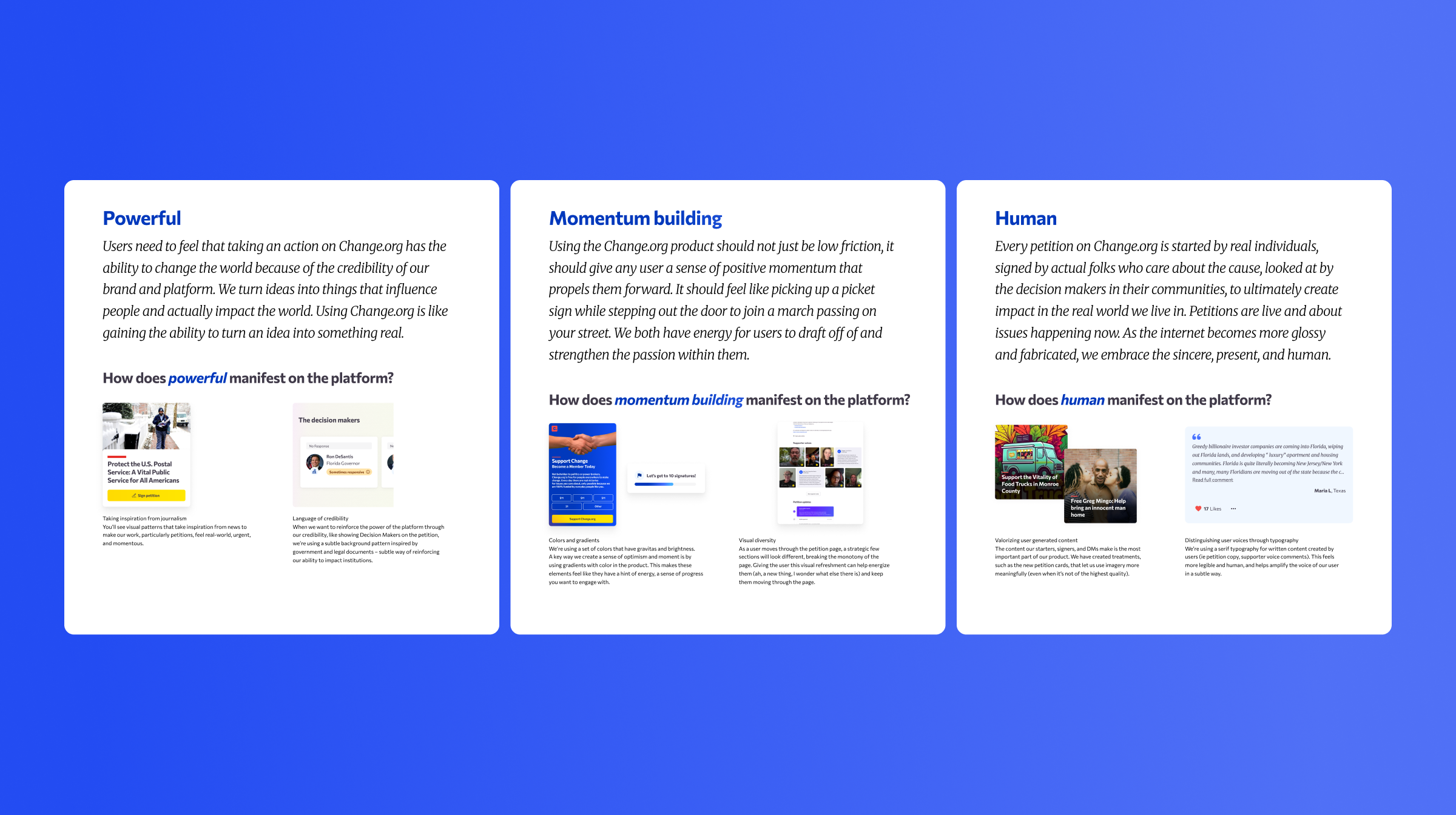
My documentation of the new design system principles and how they manifested themselves on the platform. This was done to support the design team to understand how to apply the new styles and components.
A nod to the language of DIY campaign graphics
The previous design system lacked any illustration assets or guidelines, which often led to the design team using oversized icons where a more expressive illustration would have communicated better. I created a library of spot illustrations for our key messages, combining magnified print textures with hand-drawn marks, inspired by grassroots campaign posters.
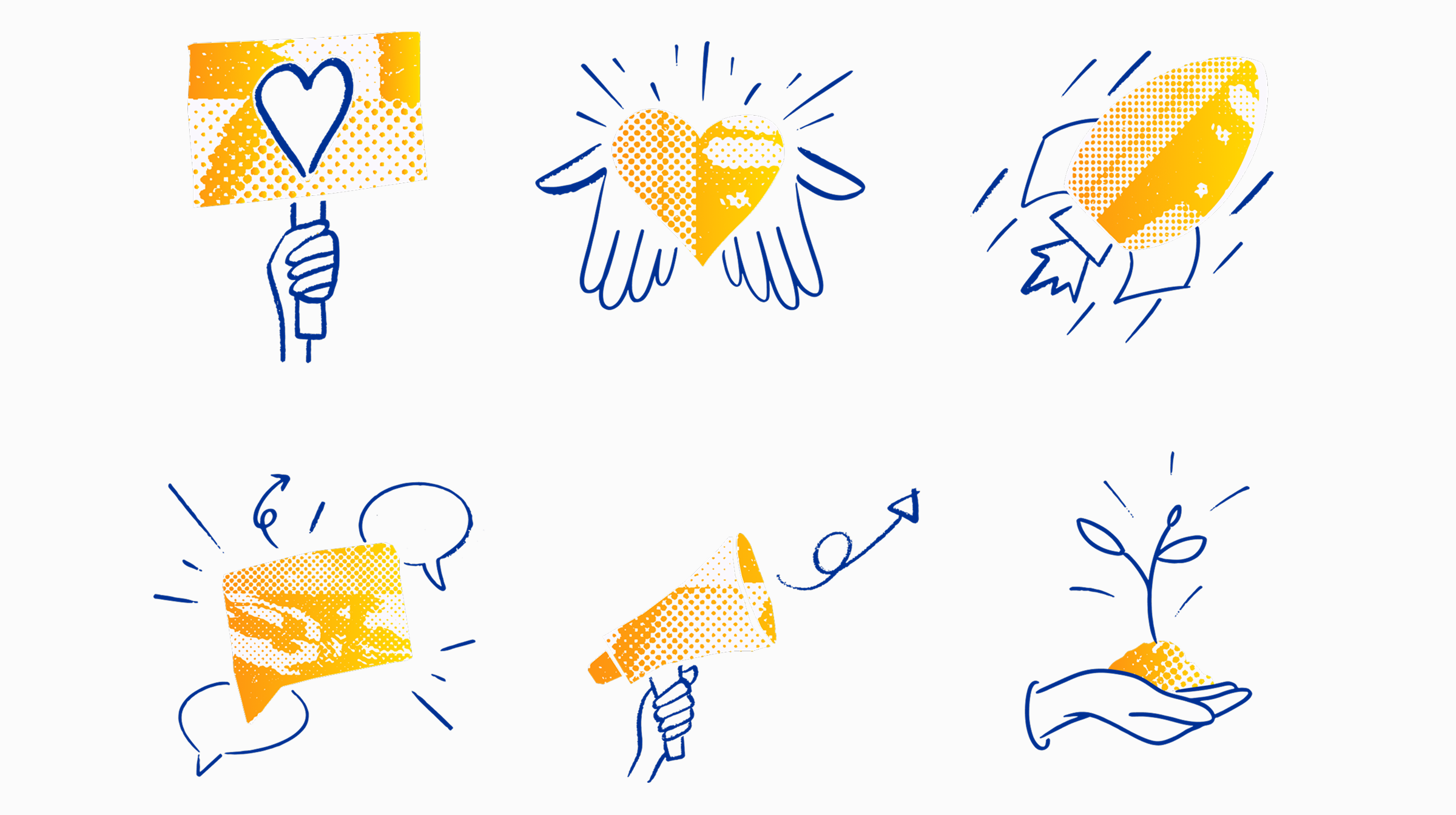
The new spot illustration style I created is a visual nod to DIY campaign posters.
Redesigning the petition page
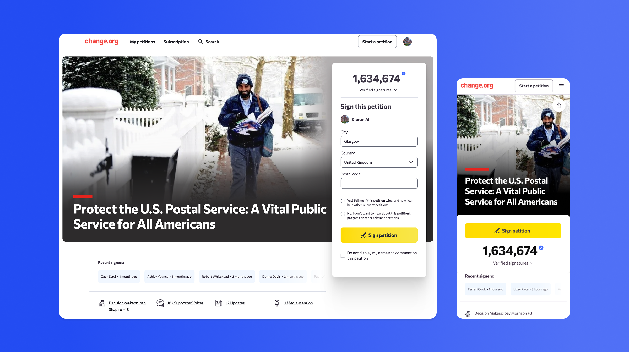
In parallel with my work on the design system, I was Lead Designer on the product team responsible for the petition pages, which account for over 90% of site traffic. Research I conducted found that most users arrive at petition pages via a link from a friend, family member or social media. They usually already have context and often decide whether to sign based on the image and headline alone. Using that insight I chose to elevate those elements to create a more impactful ‘poster’ layout.
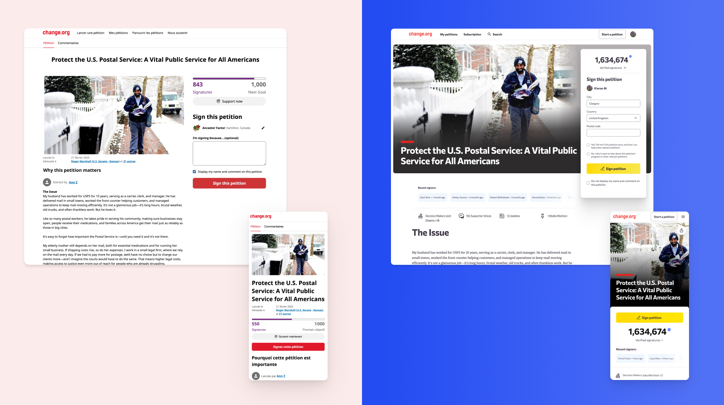
Comparison of the old and new petition page. My redesign led to a 5.4% increase in petition signatures.
Giving a sense of rhythm to the page
As part of the petition page redesign I focussed on the content design and making each page section feel unique. This helped to create visual variety over what could often feel like a wall of text in the original design. It introduced a sense of rhythm that made it easier for users to quickly scan a petition. Breaking the project down in this way also allowed us to deploy the new design in stages and run experiments on each part of the page individually to measure the individual impact.
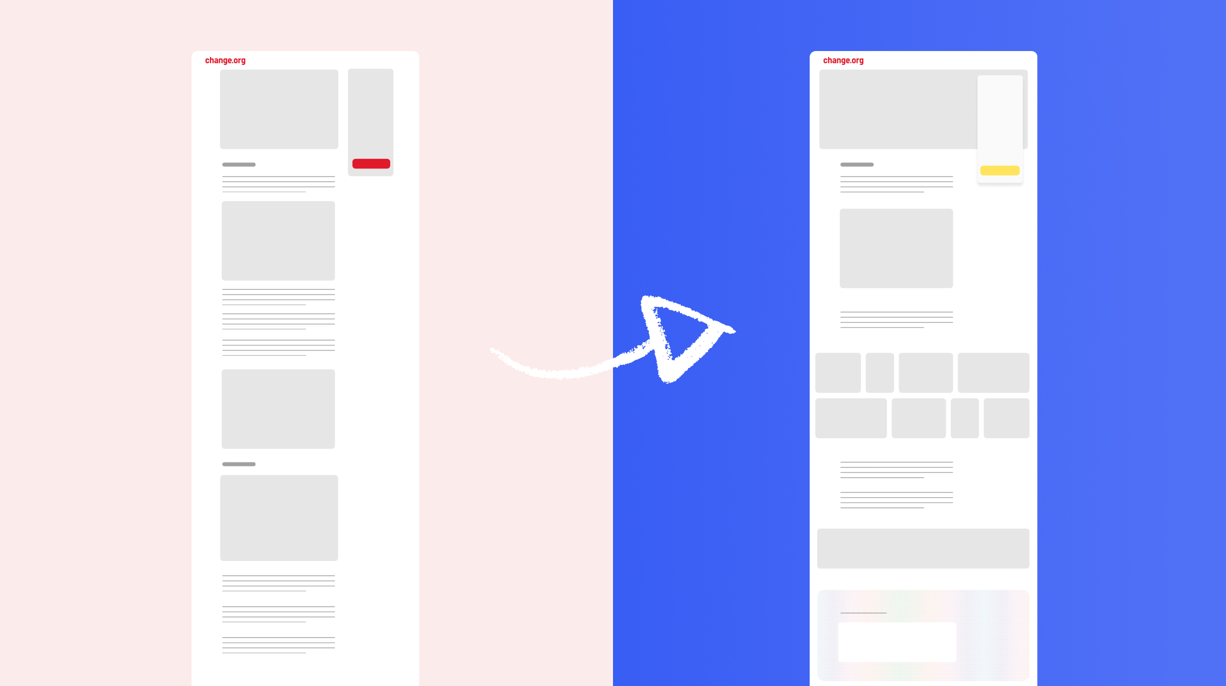
The old petition page layout could feel like a solid mono block of content with little variation across the page. My new design aimed to break the page up into more manageable section of content with more visual variation to better engage users as the scroll.
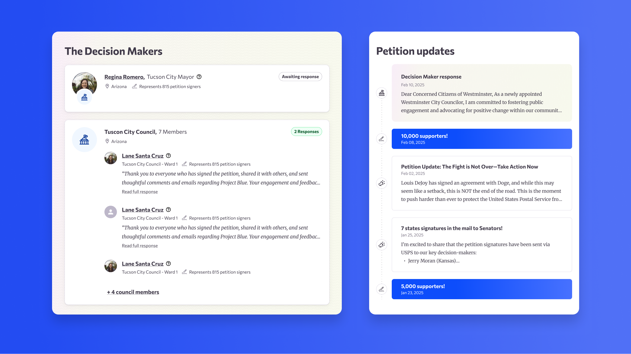
Examples of two petition page content blocks. In the previous design these were almost identical in style so I redesigned them to better reflect the content and create more variation on the page.
A feeling of being part of a larger movement
The previous petition page could feel static. In the redesign I looked for opportunities to give a sense that by signing a petition you were joining part of a real life movement of fellow humans trying to make the change they wanted to see in the world. I amplified our user generated content, which in turn increased the number of supporters leaving videos and comments.
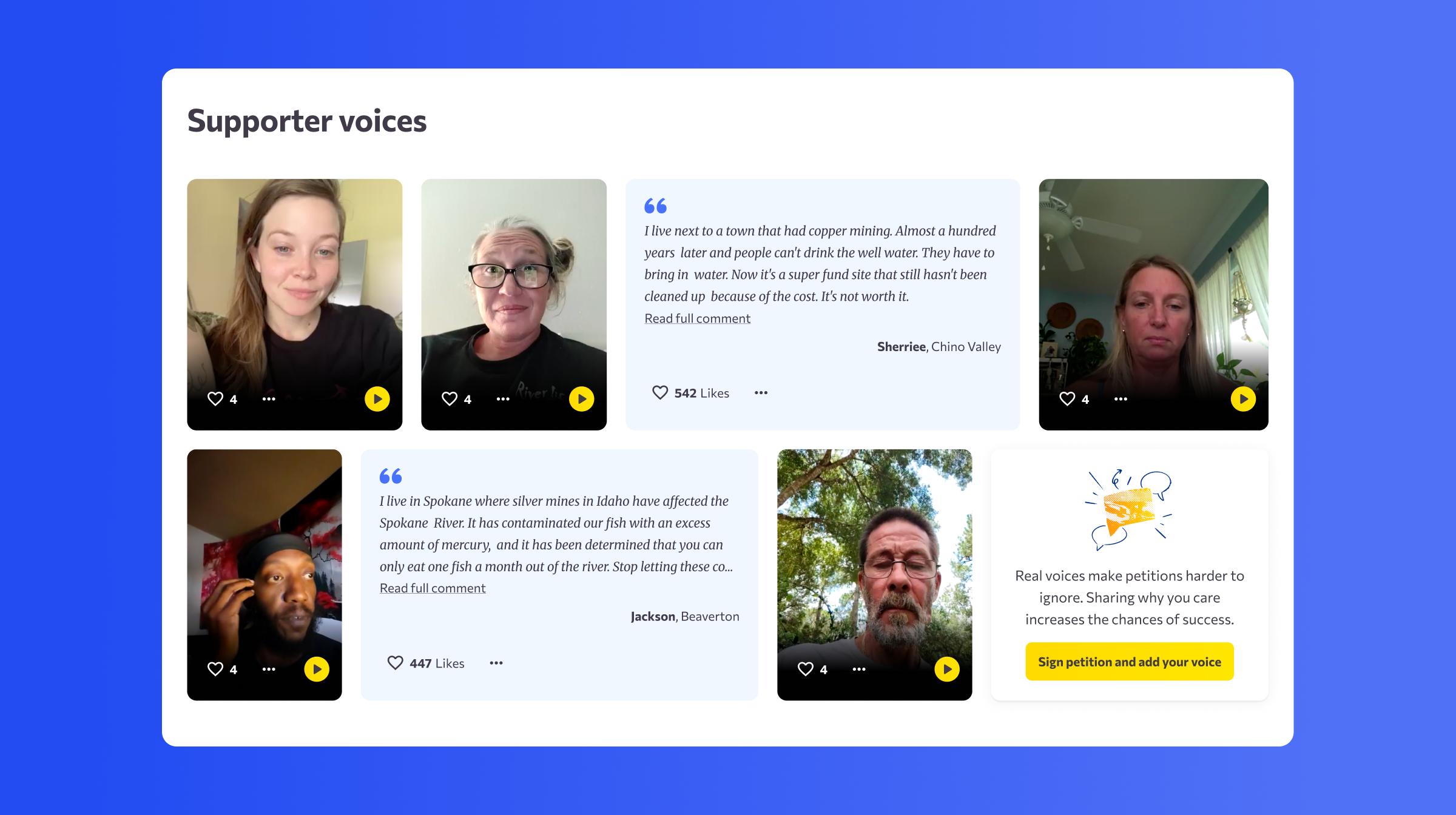
For the ‘Supporter Voices’ section I combined video and written testimonials to create a more dynamic layout and to be more flexible with the varying levels of user generated engagement that different petitions might achieve.
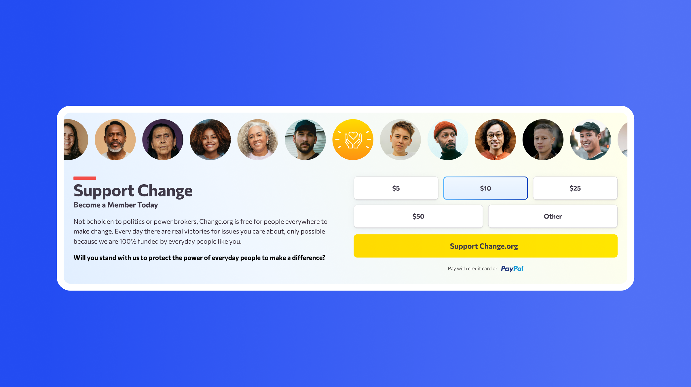
Promotional banners, like this one for membership, introduced images of people to give a better sense that by lending your support you were joining a larger civic movement for change.
Impact
The new design system was deployed in carefully planned stages, with controlled experiments on each part of the journey so we could measure small changes and roll back quickly if required. This accelerated our learning and enabled faster decision-making and iteration.
We set out with the goal of not harming our metrics but in the first three months after implementing the new design system we saw significant improvements:
- +5.4% increase in petition signatures,
- +2.6% increase in signers paying to promote petitions,
- +10% increase on new petitions started from the homepage.